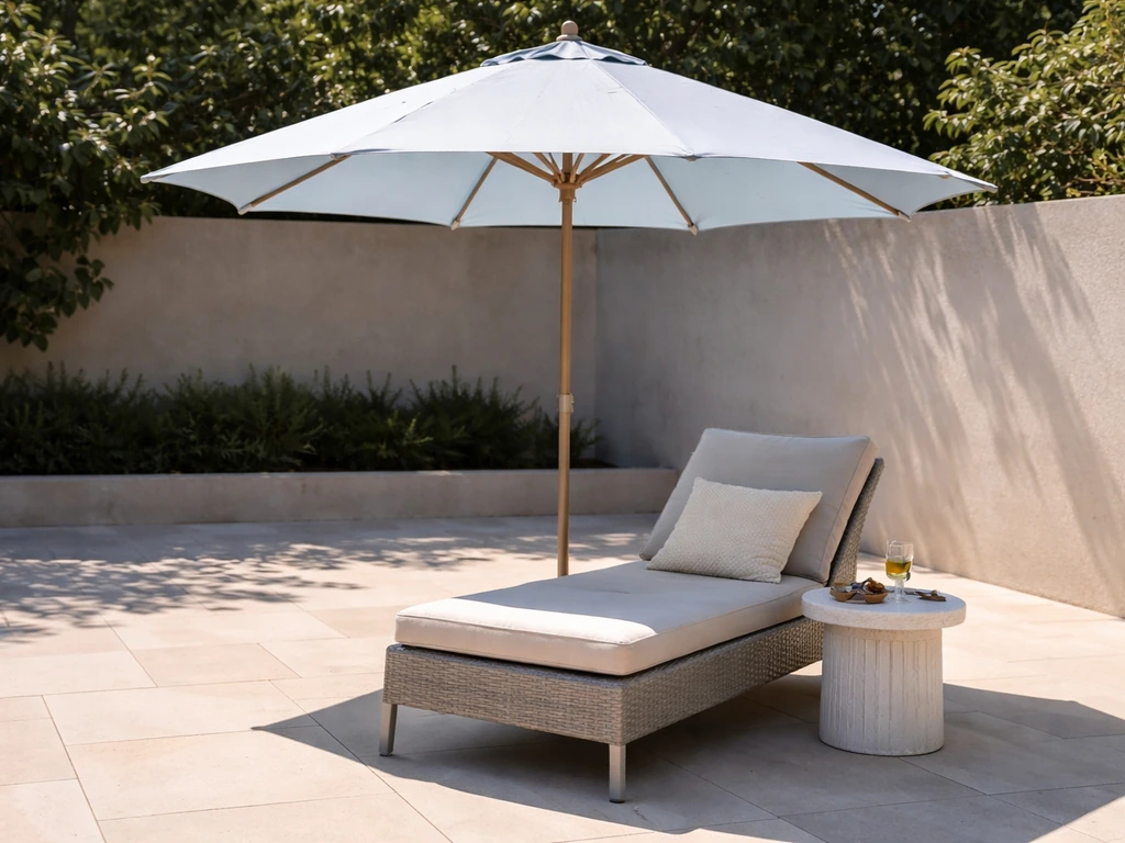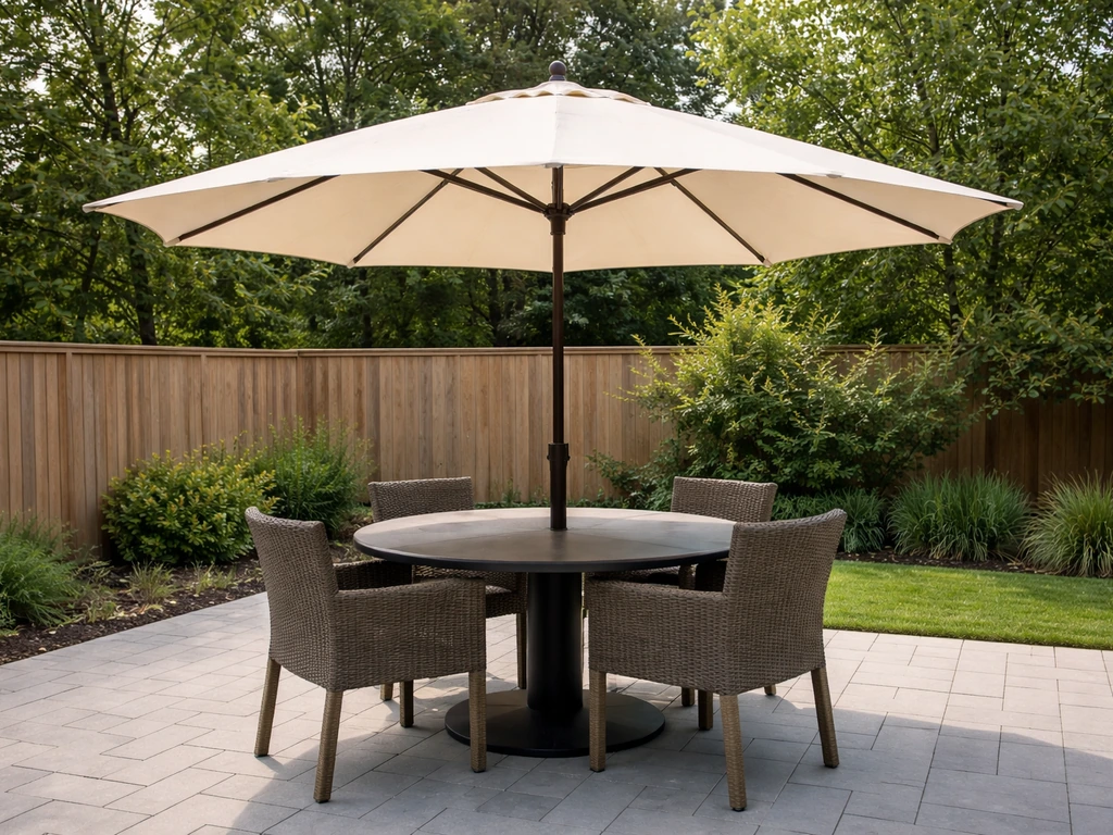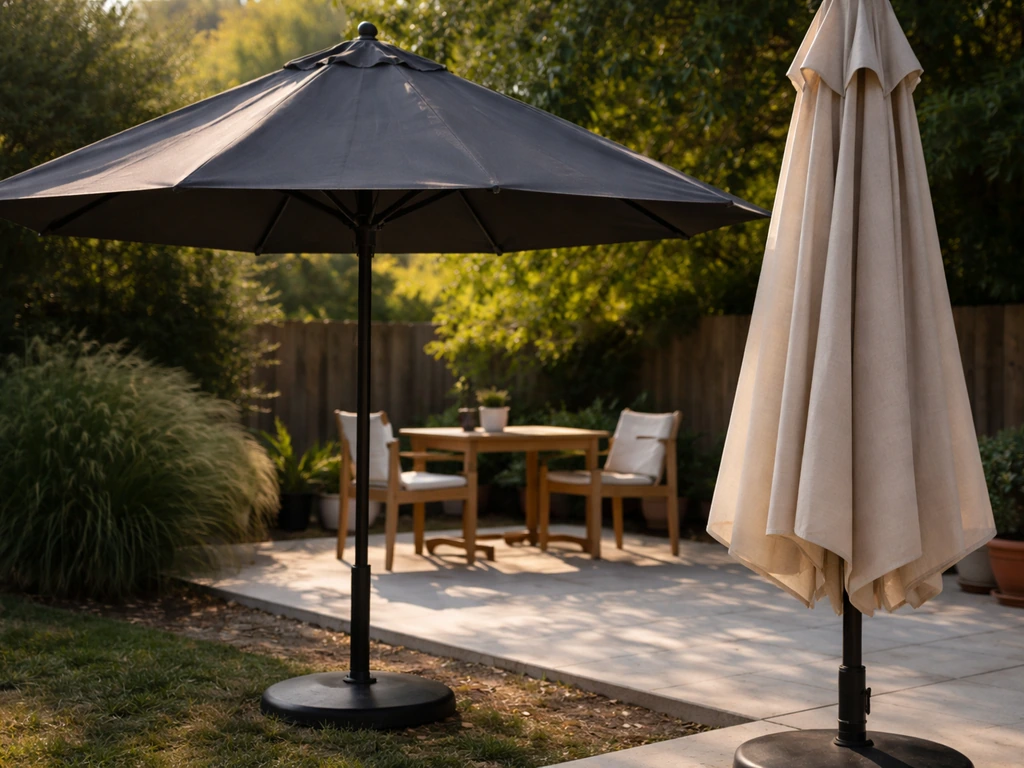
The right patio umbrella color comes down to three things working together: what you already have on your patio (furniture, flooring, siding), how much sun that space gets, and how long you want that color to look good without fading. For most patios, a neutral like warm gray, taupe, or soft white gives you the most flexibility and ages the best. If your space can handle a statement, navy, terracotta, or forest green read beautifully in natural light and pair well with nearly any wood or metal finish. The sections below walk you through exactly how to make that call for your specific setup.
How to Choose Patio Umbrella Color: Best Match Guide

Kent Lang
9 Jul 2026
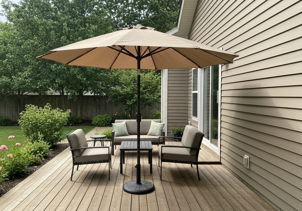
Start with your space and style goals
Before you even look at swatches, spend five minutes thinking about what you actually want your patio to feel like. Is it a calm retreat where you want everything to feel relaxed and coordinated? Or do you want the umbrella to be a design moment, a pop of color that pulls the whole space together? Those two goals lead to very different color choices, and knowing which camp you're in saves a lot of second-guessing later.
Walk out to your patio and take stock of what's already there. Note the dominant colors in your furniture (cushion fabric, frame finish), the flooring or deck material (light concrete, warm teak, gray composite, red brick), your home's exterior paint or siding, and any greenery or landscaping nearby. These are the fixed elements your umbrella color needs to work with, not against. Also note the sun exposure: a south-facing patio in full sun all afternoon has very different requirements than a partially shaded east-facing space that only gets morning light.
Finally, think about scale. A 9-foot market umbrella over a small bistro table has a very different visual presence than an 11-foot cantilever unit anchoring a full dining setup. Larger canopies bring more color into the space, so bold choices can easily overwhelm a compact area. If your patio is on the smaller side, a neutral or soft mid-tone will feel more balanced than a saturated statement color.
Match patio umbrella color to your existing decor and materials
The easiest path to a cohesive look is to pull from something already on your patio and either match it closely or contrast it intentionally. Here's how that works for the most common patio setups.
Wood decks and teak furniture
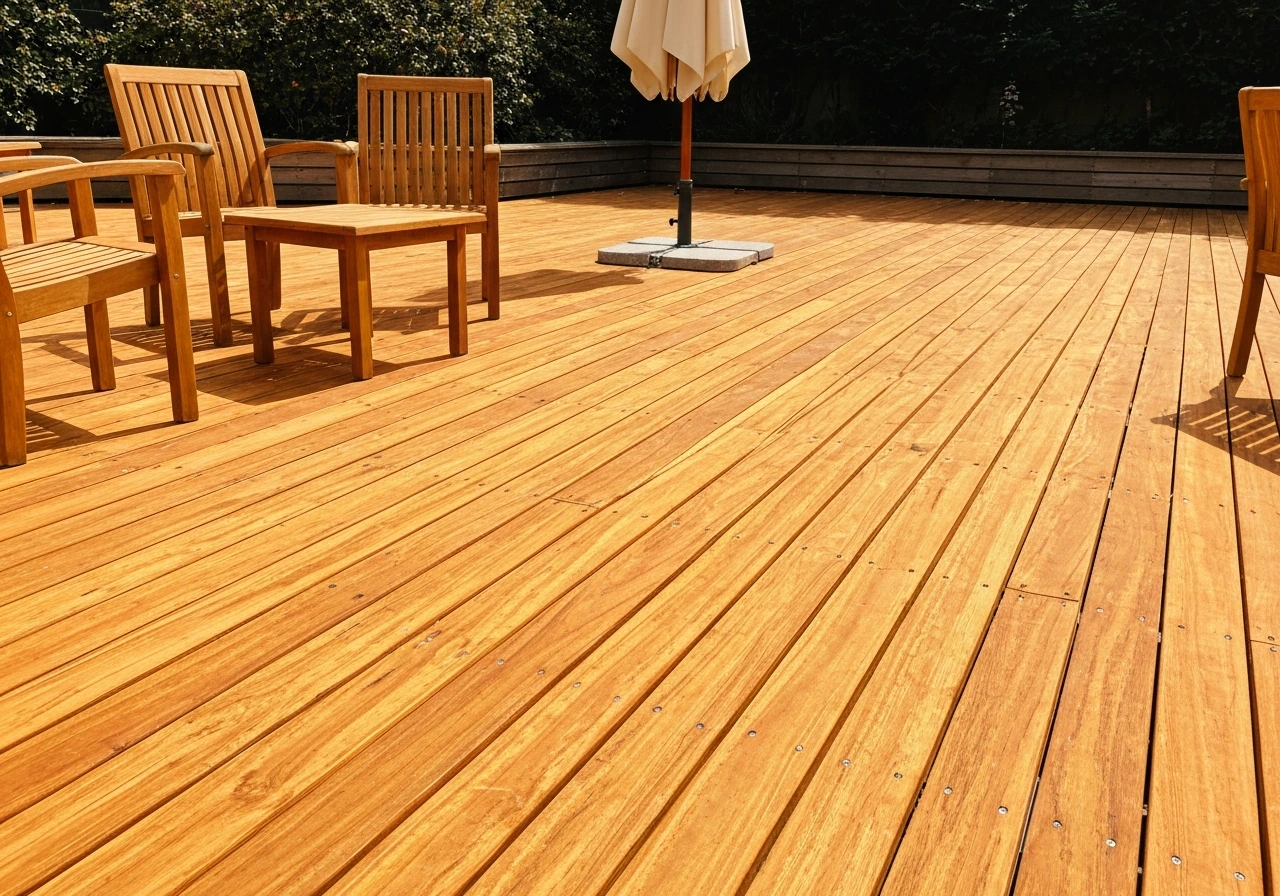
Warm wood tones have orange and amber undertones, which means they pair best with colors on the warm side of neutral: cream, tan, warm white, terracotta, olive, or a dusty coral. Navy and forest green also work well here because they contrast without clashing. Avoid cool grays with a blue undertone next to golden teak, they can look disconnected rather than deliberately contrasted.
Gray composite decking or concrete
Gray surfaces are cool-toned, so they play well with white, charcoal, soft blue, slate, or greige. Mid-tone greens and teal work here too. Warm oranges or heavy earth tones can look out of place against cool gray decking unless you've deliberately brought in warm furniture to bridge the gap.
Red brick or terracotta tile
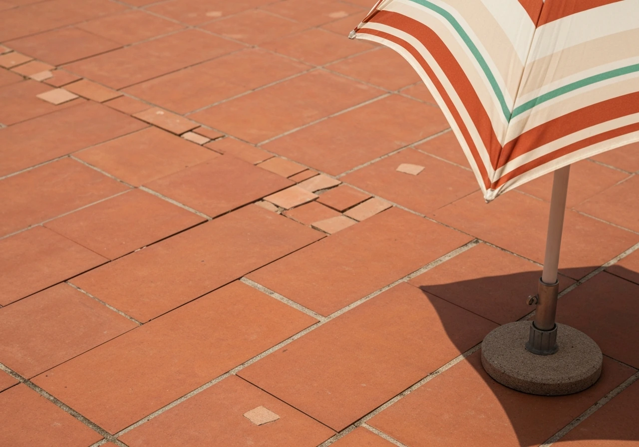
Brick has strong warm-red undertones. Cream, off-white, and warm beige blend naturally with it. Striped canopies in cream and rust or cream and green are classic for this reason. Avoid anything with a pink or purple cast, it will pick up on the red in the brick and look muddy.
White or light gray exterior siding
This is the most flexible backdrop because it's nearly neutral. Almost any umbrella color works here. The risk is that a white umbrella against white siding disappears visually, so if your home exterior is very light, consider a soft color with some presence: dusty blue, warm taupe, sage green, or a classic stripe.
Metal furniture frames: bronze, black, or aluminum
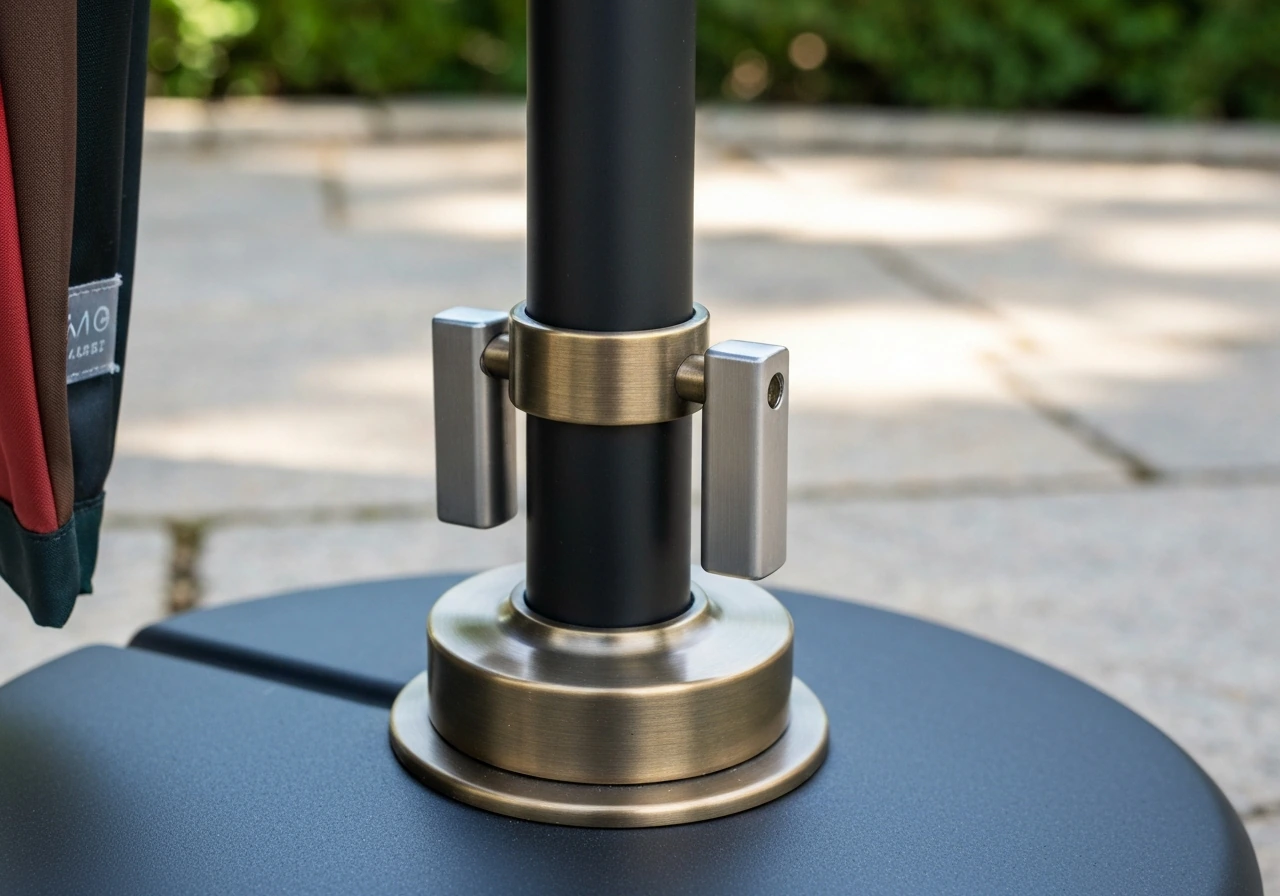
Don't overlook the frame color of your umbrella base and pole. A matte black pole pairs cleanly with charcoal, white, or bold jewel tones. Bronze or antique brass hardware echoes warm neutrals and earthy tones. A brushed aluminum stand can go either warm or cool depending on the canopy color next to it, but it leans modern, so pairing it with crisp white or cool gray looks sharp.
Use color theory for shade, heat, and visual balance
Color isn't just aesthetic on a patio umbrella, it has real functional consequences that affect comfort under the canopy.
Light vs dark: the heat difference is real
Dark-colored canopies (black, deep navy, hunter green) absorb significantly more heat than light ones. In direct afternoon sun, the surface temperature difference between a dark and a light canopy can reach around 10 to 15 degrees Fahrenheit, with research on surface albedo showing differences of up to about 10 degrees Celsius between high and low-reflectance surfaces under peak solar radiation. That heat radiates downward, which means dark umbrellas can make the space underneath noticeably warmer on a hot summer day.
Light colors (white, cream, pale gray, soft yellow) reflect more sunlight and keep the area underneath cooler. Ovios similarly notes that light-colored canopies reflect more sunlight, absorb less heat than dark canopies, and can increase glare for the eyes [Light colors (white, cream, pale gray, soft yellow) reflect more sunlight and keep the area underneath cooler. ](https://www. ovios-home.
com/blogs/news/light-vs-dark-patio-umbrellas). For the coolest feel in hot sun, prioritize a light-colored canopy and consider a pale blue, cream, or soft gray light colors. The trade-off: light canopies can also increase glare bouncing sideways, which some people find uncomfortable.
Warm vs cool tones and visual comfort
Colors have undertones that either warm up or cool down a space visually. Warm tones (cream, terracotta, warm beige, soft yellow) tend to make a patio feel inviting and lush. Cool tones (white, slate gray, pale blue, soft green) feel crisp and modern. Neither is objectively better, they just set different moods. The key is that your umbrella, furniture, and surroundings all lean in the same general direction. Mixing a warm-toned wood table with cool-gray cushions and a terracotta umbrella creates tension. But swap that terracotta for a warm olive green and suddenly everything connects.
Contrast vs harmony
Harmony means using colors close to each other on the color wheel or matching in tone (all warm neutrals, all muted mid-tones). It's safe, easy, and calming. Contrast means using opposite or very different colors to create visual interest, a white umbrella over a dark charcoal dining set, or a navy canopy over natural rattan. Contrast looks intentional and sophisticated when the tones are balanced, but can look accidental or clashing when there's no through-line. A good rule of thumb: pick either harmony OR one point of contrast, not several.
Pick between neutral vs bold colors (and common combinations)
Most people land in one of two camps: those who want the umbrella to blend in and those who want it to be a design feature. Both are valid approaches. Here's how to execute each one well.
Going neutral
Neutrals are the lowest-risk choice and arguably the most durable visually, they don't go out of style and they work with almost any furniture change you make down the line. The best neutrals for patio umbrellas are warm white, natural tan or linen, greige (gray-beige), and soft charcoal. These hold up well in direct sun, show dirt less than pure white, and fade more gracefully than saturated colors. They're also the best choice if your patio already has a lot going on visually: colorful cushions, patterned tile, or bold landscaping.
Going bold
Bold colors work best when the rest of the patio is relatively restrained. If your furniture is simple (dark frames, neutral cushions), a rich navy, deep teal, burnt orange, or olive green canopy can anchor the whole space. Stripes are a proven formula: cream and navy, cream and forest green, or white and terracotta all read as classic outdoor looks in natural light. The risk with bold colors is scale, on a large 11-foot or 13-foot cantilever canopy, a saturated color becomes a dominant feature of your entire backyard, not just your patio.
| Color / Combination | Works Best With | Avoid Pairing With |
|---|---|---|
| Warm white or cream | Teak, wicker, warm wood, brick | Cool gray-dominant setups |
| Greige / warm gray | Nearly anything; very versatile | Very warm terracotta-heavy palettes |
| Navy blue | White, gray, natural wood, teak | Red brick without a buffer element |
| Terracotta / burnt orange | Warm wood, cream, greenery | Cool gray decking or siding |
| Forest / olive green | Wood, white, gray, most neutrals | Red or orange-heavy palettes |
| Charcoal / dark gray | White furniture, modern setups | Hot climates in full sun (heat gain) |
| Cream and navy stripe | White or gray furniture, teak | Very busy patterned cushions |
| Cream and green stripe | Brick, wood, garden-adjacent patios | Already very colorful spaces |
Avoid common color mistakes (fading, stains, undertones)
A few color mistakes come up again and again, and most of them are easy to avoid once you know what to look for.
Ignoring undertones
This is the most common mismatch. Beige and gray seem like safe neutrals until you notice that your 'gray' patio furniture has blue undertones while your new 'gray' umbrella has a green undertone, and they look wrong side by side. Always check whether a neutral leans warm (yellow, orange, pink) or cool (blue, green, purple) before committing. Hold the swatch next to your furniture and your deck, not just against a white background.
Choosing a color that overwhelms a small space
A deep saturated color on a large canopy can dominate a compact patio and make it feel smaller and heavier. In tight spaces, stick to lighter tones or subtle patterns that add interest without visual weight. This applies especially to offset and cantilever umbrellas, which often use larger canopies (11 to 13 feet) and sit at angles where the full canopy face is visible from multiple directions.
Picking a color without accounting for fading
Bright, saturated colors fade faster than muted or darker tones in UV-exposed settings, especially with lower-quality fabrics. For the best fade-resistant patio umbrellas, choose blank" rel="noopener noreferrer">solution-dyed acrylic and target high lightfastness ratings so the color stays true through repeated sun exposure. A vivid red or turquoise that looks great at purchase can turn into a washed-out version of itself within a season if the fabric is piece-dyed polyester rather than solution-dyed acrylic. Medium and darker mid-tones (navy, olive, charcoal) tend to fade more gracefully since the base tone has more depth to give before it looks noticeably degraded.
Underestimating stain visibility
Pure white and very pale cream show bird droppings, pollen, mildew, and dirt immediately. They require more frequent cleaning to stay looking good. Medium tones (tan, greige, navy, olive) hide light dirt and dust far better. If low maintenance matters to you, avoid the very lightest end of the spectrum.
Not checking how the color looks in shade vs sun
Colors look dramatically different in direct sunlight versus shade, and an umbrella canopy spends time in both states (open vs closed, morning vs afternoon). A warm tan can look almost golden in morning sun and flat or washed out in full noon light. Navy can look rich and saturated in shade but nearly black in direct sun. Testing your swatch in both conditions on your actual patio is the only way to know for sure.
Test before buying: samples, swatches, and fabric considerations
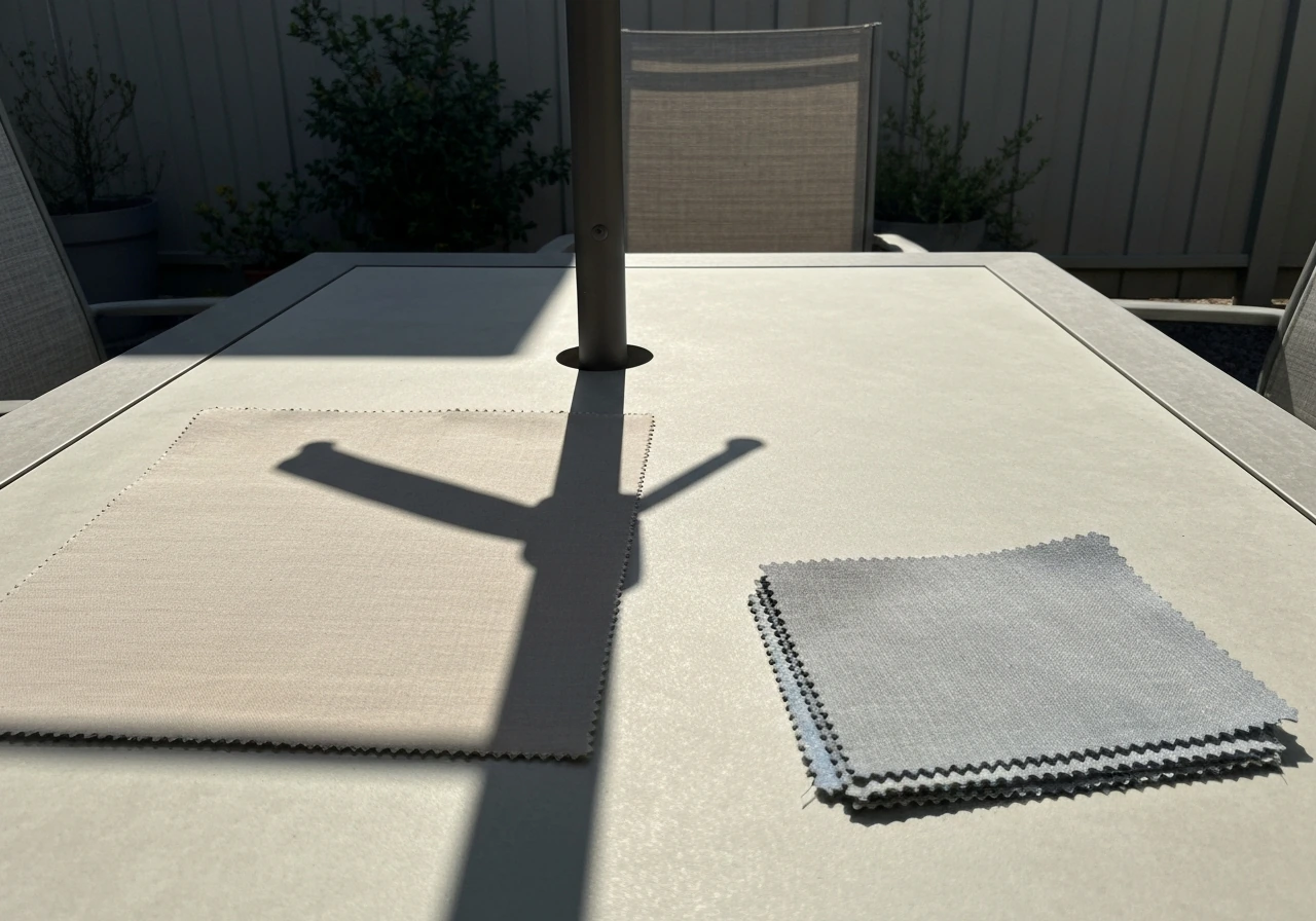
Online product photos are shot under controlled studio lighting and will not tell you what a color looks like on your patio at 3pm. If you're spending $200 or more on an umbrella, it's worth getting a fabric swatch first.
Most major outdoor fabric brands (Sunbrella being the most widely available) offer swatch samples you can order or pick up at retailers. Get the largest sample available, a 4x4 inch chip won't tell you much. Bring that swatch outside and hold it next to your furniture, against your deck, and near your home's exterior. Check it in the morning light, again in the afternoon, and once more on an overcast day. Colors shift significantly between these conditions, and what looks perfect at 9am can look off at noon.
The fabric material itself matters as much as the color. Solution-dyed acrylic is the gold standard for outdoor umbrellas: the dye is locked into the fiber at the molecular level during manufacturing, not applied to the surface afterward. This means UV rays have no dye to strip away from the fiber surface, and the color stays consistent far longer than piece-dyed alternatives.
Choosing a patio umbrella that will not fade starts with a solution-dyed fabric designed to resist UV wear over time. Quality solution-dyed acrylic typically tests at a lightfastness rating of 7 to 8 on the ISO 105-B02 Blue Wool Scale, compared to around 4 to 5 for most interior fabrics. Sunbrella's solution-dyed acrylic, for example, is rated for outdoor UV exposure and maintains colorfastness through extended sun exposure.
For direct-sun or coastal exposure, a lightfastness rating of 7 or higher is the minimum worth targeting. Any color you choose will look better longer on a quality solution-dyed fabric, especially saturated or bold tones that would otherwise fade quickly.
Also pay attention to fabric finish. A matte finish reads softer and more natural in outdoor settings, while a slight sheen can increase glare in bright sun. If you're choosing light colors for heat reflection, know that some fabrics labeled as 'bright white' have a shinier finish than 'natural white' or 'canvas white,' and the glare difference is noticeable when you're sitting under the canopy.
Coordinate for different umbrella styles and locations
Color coordination doesn't happen in a vacuum, the style of umbrella you choose changes how the color reads in your space. A market umbrella (center pole) sits directly over the table and the canopy is mostly viewed from below and from the side. A cantilever or offset umbrella, where the support pole is positioned to the side with an arm extending outward over the space, shows much more of the canopy face from a standing or seated eye level. That means the top surface of the canopy is more visible and more of a visual feature with a cantilever, the color you choose is literally more prominent.
For market umbrellas, the inside of the canopy (what you see when sitting under it) is the primary color experience. Light, warm tones here create a pleasant glow without color-casting onto food and faces. A deep navy or green on the inside creates atmosphere but can cast a slightly colored light that some people find unflattering. For cantilever and offset umbrellas, the top and side of the canopy face outward more visibly, so the color integrates with the broader yard and home exterior, not just the furniture underneath. This is where coordinating with siding color and larger landscaping elements becomes more important.
The pole and base color are part of the coordination too. A bronze pole and a heavy stone base read warm and traditional. A matte black steel base with a black or aluminum pole reads modern. Matching or complementing the pole finish to the furniture frames (all black, all bronze, or deliberately mixed metals with a consistent undertone) ties the whole setup together more effectively than choosing a canopy color in isolation.
Also consider where the umbrella sits relative to your home's views. If it's visible from inside through a patio door or large window, the color you choose is part of your interior view too. A color that looks balanced in isolation outdoors can feel jarring if it doesn't connect at all with the interior palette visible through the glass.
Your shortlist method: narrowing to the right choice
Here's a practical way to get to a decision without overthinking it. Use the steps below to narrow your options to two or three candidates, then test only those. Once you have a couple of candidates, use these steps to confirm you’re really following how to choose patio umbrella size, style, and color for your specific space.
- Identify your fixed palette: deck/flooring color, furniture frame finish, and home exterior tone. Write down whether each reads warm, cool, or neutral.
- Decide on your approach: harmony (umbrella matches or closely complements existing tones) or contrast (umbrella creates one intentional focal point). Pick one.
- Filter by function: if you're in a hot, full-sun climate and want maximum comfort underneath, eliminate very dark canopy colors from your shortlist. If stain resistance matters, eliminate very light ones.
- Filter by fabric first: commit to solution-dyed acrylic with a lightfastness rating of at least 7. Then look at available colors within that fabric category — don't pick the color first and accept whatever fabric comes with it.
- Order swatches for your top two or three candidates. Take them outside to your actual patio and view them at different times of day: morning, midday, and late afternoon. Hold them against your furniture and your deck material at the same time.
- Eliminate any swatch that looks off in the afternoon light (the harshest lighting condition), since that's when colors tend to reveal undertone mismatches or look washed out.
- Choose the one that looks best in the broadest range of conditions, not just the best single moment.
Once you've landed on the right color, make sure the umbrella specs actually deliver on the look long-term. Beyond solution-dyed acrylic and a lightfastness rating of 7 to 8, look for canopies with a UPF 50+ rating if sun protection matters to your household, quality outdoor fabrics at this spec allow less than about 2% of UV through the canopy. If sun protection matters most, prioritize a UPF 50+ umbrella and choose lighter canopy colors since they reflect more heat UPF 50+ rating. That combination of color choice, fabric quality, and UV rating is what keeps your umbrella looking as good in year three as it did at purchase.
FAQ
What should I do if my patio colors are mostly neutrals, but I cannot tell if they are warm or cool?
If your patio is mostly beige, gray, and white, avoid choosing a single “middle” gray. Instead, pick a neutral that matches the undertone of your dominant surface (warm if your cushions or siding read creamy, cool if they read silvery), then add a tiny reference point, like a stripe or a matching frame finish, so the umbrella looks intentional instead of mismatched.
How do I choose a color when my patio hardware is stainless steel or brushed aluminum?
Match the canopy undertone to the furniture undertone, then decide glare and heat. For example, with stainless or brushed aluminum frames, crisp white or soft gray can look very clean, but a matte fabric will reduce harsh reflections compared with a slightly shiny “bright white” fabric.
Will a dark umbrella color look different under the canopy than it does on the ground?
Test swatches specifically for sun and angle, not just morning versus afternoon. Hold the fabric at the same height you would normally see the canopy (seated eye level for cantilever styles, underneath view for market styles), then check whether the color casts light on faces or food. A navy or deep green that looks rich in the yard can feel heavy or unflattering when viewed from under the canopy.
Can I use a patterned or striped umbrella to fix a color mismatch between furniture and siding?
A striped canopy can be the easiest way to “bridge” clashing undertones. Choose stripes that include one color from each side of the palette you are trying to connect, for instance cream plus navy for warm woods plus cool-gray cushions, or cream plus forest green for mixed neutrals.
What umbrella colors hide dirt and mildew best?
If you are worried about maintenance, avoid very pale cream and pure white, even if they look perfect in photos. Medium tones like tan, greige, navy, or olive hide pollen and mildew better, and they usually look more consistent after a season of outdoor use.
How should color choice change for coastal or very sunny climates?
If you live in a high-UV or coastal area, choose solution-dyed acrylic and target a higher colorfastness level, then favor mid-tones over very saturated brights. Very vivid colors can look great at purchase but can shift toward washed-out versions sooner, especially on large canopies that expose the fabric to intense sun all day.
What is the best way to avoid over-coordinating or creating a confusing color mix?
Start by matching only one “through-line” and let the rest be secondary. Pick either harmony (all warm tones or all muted mid-tones) or one strong contrast point (for example, a navy umbrella against a charcoal set), then keep other elements neutral so the umbrella remains the focal decision rather than one of several competing colors.
How do I choose an umbrella color if it will be visible from inside through a window?
If your umbrella is visible from indoors, do not rely only on how it looks outside. View it through your patio door or large window at different times of day, and make sure the color direction (warm versus cool) matches your interior adjacent palette, otherwise it can look like a separate design “layer.”
Can I still choose a bold umbrella color if my patio is small?
Yes, and the risk depends on style. On offset or cantilever umbrellas, the top of the canopy is visible and color reads as a larger visual block, so dark saturated choices can feel dominant in small backyards. In compact spaces, lean toward light neutrals, muted mid-tones, or restrained patterns to keep the canopy from visually shrinking the area.
What should I do if I cannot order a fabric swatch before buying?
If you cannot get a fabric swatch, use a practical workaround: buy from a retailer with an easy return policy, then compare the product color against a printed fabric or photo target that matches your siding undertone. Still, photos under studio lighting can mislead, so treat online color as a starting point, not the final decision.
How do I balance staying cool with avoiding glare when choosing an umbrella color?
If your main concern is sun comfort, prioritize light canopy colors and fabric performance together. A light-colored canopy generally reflects more sunlight, which reduces underside heat, but too much sheen can increase glare, so choose a matte or low-sheen finish when possible.
What if the exact color I want looks unavailable, how do I pick a close alternative?
Order two sizes of “candidates” thinking in terms of tone, not just color name. For instance, instead of “navy,” consider navy-leaning charcoal versus true navy, because small undertone shifts can make a big difference against warm wood or cool gray decking.